
The Web Empire Blog
Important rules for web typography
 The basic rules of Typography is a resubmit from an article of Webdesigner Depot. This article came to my attention few years ago and since then I'm constantly trying to follow all of them.
When someone visits a website you’ve designed, the odds are that they don’t care much about the colors, images or sounds, they’re immediately looking at the text. No matter how many bells and whistles you’ve built into a website, everyone relies on text to accomplish whatever they’re visiting the site to do. That alone should make typography, the art of arranging type, a priority for any web designer.
In this article we take a look at 10 easy rules to keep in mind when designing your next web project.
1. Read through the text yourself
With a design like JonesingFor a designer without a great grasp of the text would have struggled to put together the typography that makes this site really work. As you tackle your own typography, you probably don’t have to worry about writing a site’s text — but you do have to read it!

Some web designers think that just copying and pasting out of a text file constitutes the total of their textual duties. But reading through the text provides at least a basic idea of how the text can be integrated into a website, avoiding the disconnect between the writing and the design of a website.
You can kick your typography up yet another notch, if you can read through the text once it’s in place in your design. Take special note of the space around the letters. Do you have any unusually big spaces that look odd? A little careful typography can eliminate those issues. You can also get an idea of lines that might be too long to easily read, awkward line breaks and similar issues.
2. Dump Lorem ipsum as soon as possible
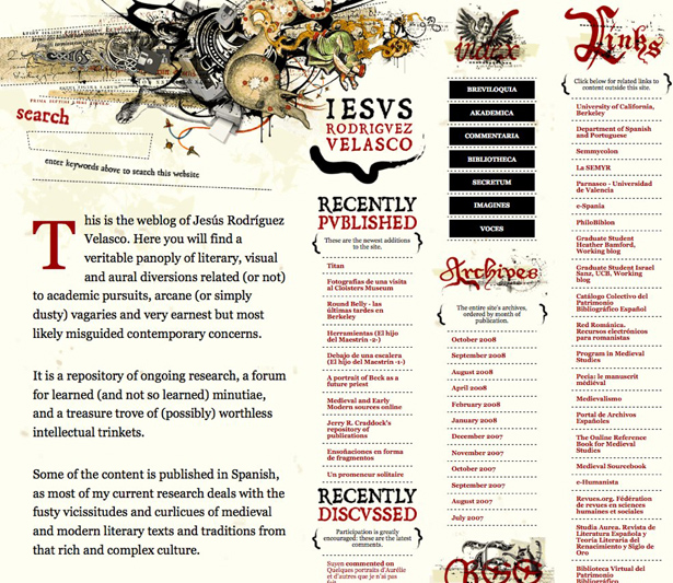
Do you think you could have designed Jesus Rodriguez Velasco’s website without the actual text? The site is heavily dependent on the written word — and very specific words too. Even the body text got special attention with a drop cap and some other tweaking that just wouldn’t have been possible with Lorem ipsum.
Unless the text of your website is actually Lorem ipsum, dummy text will bear no similarity to the real thing. That means that any tweak you might make to the text — or the design surrounding it — will have to wait until you get the real thing. Asking for (and getting) text from your client as early as possible in the process will give you the ability to match your overall design and your typography.
3. Show a clear hierarchy
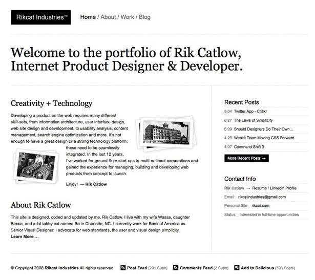
When you arrive at Rik Cat Industries, you know immediately where you should start reading. Even though there are a few links at the top of the page, Rik’s welcome catches your eye first. It’s much bigger, using typography to establish a clear hierarchy.
Every site needs a well developed hierarchy: indicators of where to start to start reading and how to proceed. Your typography can provide that hierarchy — just as Rik’s does — as long as you know your hierarchical order ahead of time. By thinking about size and typefaces, you can highlight a piece of text as a headline in a way that different placement in the design just can’t provide.
Your design’s hierarchy goes beyond just the typography you employ, of course, but since users almost always start with the text, it makes sense for designers to do the same.
4. Pay attention to both macro and micro typography
Relying entirely on typography for their front page, the Crowley Webb and Associate’s website was designed with two factors in mind: both macro and micro typography.
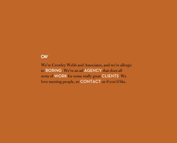
Macro typography is the overall structure of your type, how it appears in the context of your design and its aesthetic when you consider your text as a block on its own.
Micro typography is more concerned with the details of spacing, the issues that determine whether words are easy to read. Micro typography is an absolute necessity when it comes to putting together a block of text: if it isn’t legible, there’s no point in proceeding. Crowley Webb and Associates addressed this question through both careful writing and spacing out those words that the site would highlight.
But macro-typography provides you with the opportunity to make your text more than well-spaced: it’s the chance to make it look appealing and a part of your whole design. The choice of typefaces and colors on this website create a viable whole. Ignoring either facet of typography is detrimental.
5. Take care with type colors
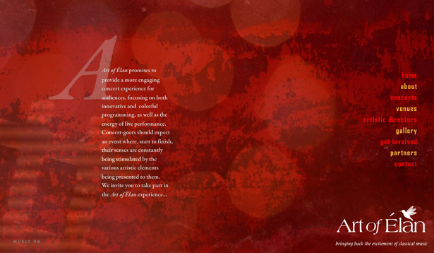
It would be so easy to lose text in the background of ArtofElan, especially the bright red on dark red combination used by the designer. When a web designer works with colored type, care is absolutely necessary, there’s no guarantee that a red on red combination, or even a yellow on red combination will be visible. After all, everyone has visited a website where the text seemed to be only one shade off from the background color and gotten a case of eye strain when they tried to read it.
The easiest fix for this situation is to make sure that the color of your type is drastically different from that of your background. Black and white work so well because they are as drastically different as you can get, but there are some color combos that work well: something along the lines of a dark blue on a light pink will get the job done. Reversed out text is pretty tricky… while you can work with light pink text on a dark blue background, you’re more likely to get a complaint about it.
6. Get serious about your CSS
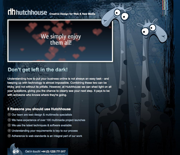
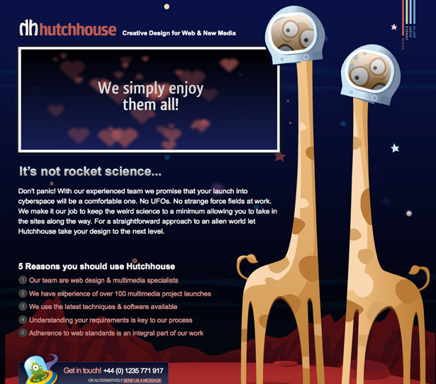
If your CSS is solid, you can move between pages of your website seamlessly, just as the different versions of Hutchouse.com rely on different stylesheets to create some impressive effects. Even if you don’t take things as far as Hutchhouse, CSS can help eliminate amateur typography issues like changing up typefaces and sizes between pages.
CSS can provide easy consistency between your typography across the entirety of a website. If you are consistent in how you use type, however, breaking that consistency even a small amount can make whatever you wish to highlight truly stand out, just like establishing and then breaking a grid can make for an effective design. In web typography, keeping your fonts consistent can be a simple matter of CSS.
7. Ditch the centered text
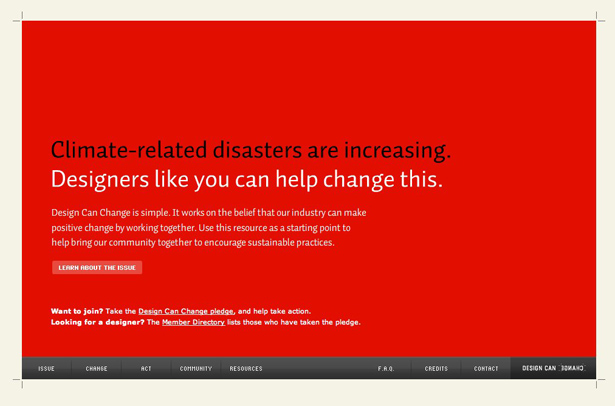
Choosing an alternative to centered text can make a website design easy to read, just like DesignCanChange.org. Opting for centered text, especially on a page like this, would make for a problematic page: the jagged edges centering creates on each side make it much harder to read and there are plenty of opportunities for perfectly centered text to wind up distorting the rest of your designs on different displays.
In some circles, centered type is only one step up from using Comic Sans in a website design. You might consider it for a headline, but in general, aligning your text to the left will make your readers much more comfortable, unless they read from right to left.
8. Deal with smart quotes and other symbols
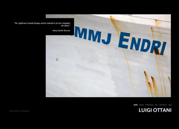
Luigi Ottani’s site showcases what careful attention to quotation marks and other symbols will get you: a complete lack of problems when the site displays those symbols. Many websites are dotted with symbols a browser cannot display. It’s a legacy of the fact that most of the text a web designer works with was probably written in Microsoft Word or another piece of word processing software that makes all sorts of little changes to text without the writer paying much attention.
One of the worst changes is smart quotes: the curly quotation marks Word automatically substitutes for straight quotation marks. Another problem area comes when you work with text written in another language: accents and umlats can cause just as much trouble as Word’s helpfulness. If you just copy and paste text with such changes into your design, you’ll likely have to go back and fix them later, at least for some web browsers.
Instead, get them early in the design process so you can focus on making your text fit better with your design. If you do want those fancy symbols and smart quotes showing up in the final design, break out your HTML entities.
9. Plan for your text to get larger
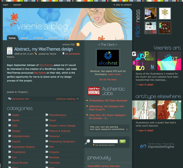
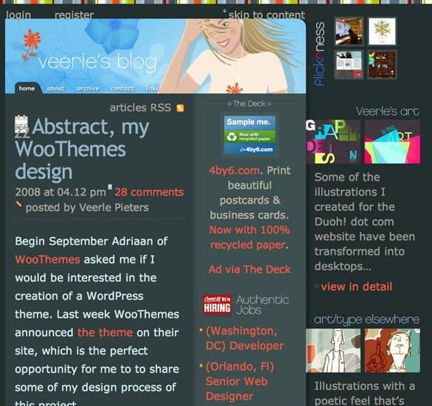
When you increase the size of the text on Veerle Pieters’ website, it’s not quite as pretty than if you use the font size she picked out. However, you can still read everything, locate links and so forth, something that is true of very few websites.
That’s because, in part, many designers make sure to layout text in 10 point font or even smaller. Most people are comfortable reading such fonts, but Baby Boomers make up a huge section of the web-browsing population and a lot of those aging web surfers are going to have their browsers set to display type as large as they can. Your text, as well as your design, needs to be able to adapt to that fact.
It’s also worth taking into account the fact that browser size can vary dramatically, moving text around to unexpected locations if you aren’t careful. If bumping the size up a point creates problems, that older demographic is going to move on to the next website in a hurry. Having to scroll forever over to the side will have a similar result.
10. Show a preference for sans serif
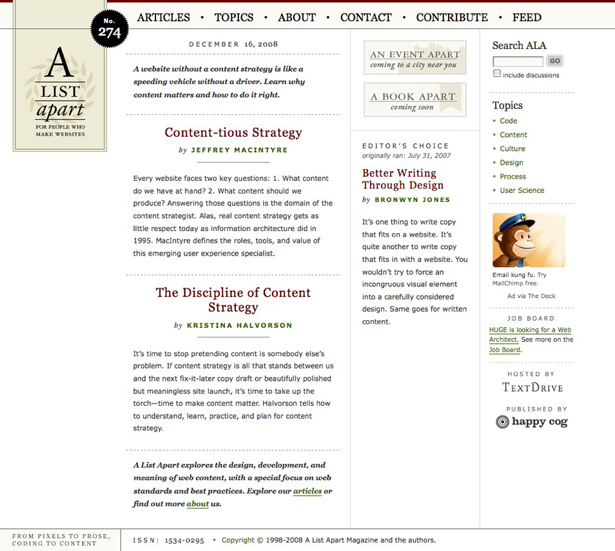
If you look at the A List Apart’s website, pretty much every big block of text is set in a sans serif typeface, making it much easier to read. Headlines and other smaller blocks of text are laid out in serifed fonts, creating a balance between the two.
When it comes to laying out text on a screen, sans serif fonts are almost always the best bet, especially if you chose a font like Verdana that was designed for display on a computer screen. Serifed fonts have a higher chance of displaying poorly, becoming blurry or even pixelated.
It’s not possible to entirely avoid serifs, of course. But for large blocks of text especially, using a font without serifs can offer an extra level of guarantee that visitors will be able to easily read a site’s text. When you’re choosing fonts for a project, look through your sans serif options first.